ひと息読書会
好きな本を一冊持ち寄って、読んだこと、考えたことを話す小さな集まり。初めての人も歓迎です。
- 頻度
- 月に一度
- 参加する人
- 初めての人も歓迎
- 持ち物
- 好きな本を一冊
当日の流れ
本を紹介する
一人ずつ、本を選んだ理由を短く話します。
言葉を持ち寄る
気になった一節と、その理由を共有します。
次の一冊を探す
聞いた話を手がかりに、次に読みたい本を考えます。
架空の読書会を題材に、見出し・紹介・3つの基本情報・当日の流れを変えずに、HTML/CSSで3つの作例を実装しました。色ではなく、何を先に見つけられるかを比べてください。
These three HTML/CSS studies use the same fictional reading group, heading, introduction, three facts and agenda. Compare what you can find first rather than the colors.
Promptiveによる説明用の作例です。AIによる再現実験ではありません。実際の開催案内・利用者調査・成果の比較でもありません。
These are authored teaching examples, not an AI reproduction experiment, a real event announcement, a user study or a performance comparison.
好きな本を一冊持ち寄って、読んだこと、考えたことを話す小さな集まり。初めての人も歓迎です。
一人ずつ、本を選んだ理由を短く話します。
気になった一節と、その理由を共有します。
聞いた話を手がかりに、次に読みたい本を考えます。
使いどころ:活動の雰囲気から知ってほしい場合。見出しが最初に目に入り、基本情報と流れを下へ読み進めます。すぐ日時を確認したい人には、情報までの距離が長くなりがちです。
参考プロンプトへの追記:「中央の見出しと短い紹介を入口にし、基本情報、当日の流れの順に並べる。スマートフォンでは大きな上下余白を減らす。」
表示例と同じHTMLです。見た目にはこのページのCSSを使用しています。HTMLだけで同じ見た目になるわけではありません。
<article class="lab-example lab-example--center" aria-label="ひと息読書会">
<div class="lab-brief"><h3>ひと息読書会</h3><p>好きな本を一冊持ち寄って、読んだこと、考えたことを話す小さな集まり。初めての人も歓迎です。</p></div>
<dl class="lab-facts"><div><dt>頻度</dt><dd>月に一度</dd></div><div><dt>参加する人</dt><dd>初めての人も歓迎</dd></div><div><dt>持ち物</dt><dd>好きな本を一冊</dd></div></dl>
<div class="lab-agenda"><h4>当日の流れ</h4><ol><li><h5>本を紹介する</h5><p>一人ずつ、本を選んだ理由を短く話します。</p></li><li><h5>言葉を持ち寄る</h5><p>気になった一節と、その理由を共有します。</p></li><li><h5>次の一冊を探す</h5><p>聞いた話を手がかりに、次に読みたい本を考えます。</p></li></ol></div>
</article>Bring a favorite book to a small gathering about what we read and think. First-time visitors are welcome.
Briefly explain why you chose your book.
Read a passage and explain what caught your attention.
Use the conversation to discover another book to read.
When to use it: Introduce the character of an activity first. Readers move from the heading down to facts and agenda; this can delay practical details for someone in a hurry.
Prompt adaptation: “Open with a centered heading and short introduction, followed by facts and agenda. Reduce generous vertical gaps on mobile.”
This is the rendered example’s HTML. Its appearance uses this page’s CSS; the HTML alone does not reproduce the styling.
<article class="lab-example lab-example--center" aria-label="A little reading room">
<div class="lab-brief"><h3>A little reading room</h3><p>Bring a favorite book to a small gathering about what we read and think. First-time visitors are welcome.</p></div>
<dl class="lab-facts"><div><dt>When</dt><dd>Once a month</dd></div><div><dt>Who</dt><dd>Newcomers welcome</dd></div><div><dt>Bring</dt><dd>One favorite book</dd></div></dl>
<div class="lab-agenda"><h4>How the gathering unfolds</h4><ol><li><h5>Introduce a book</h5><p>Briefly explain why you chose your book.</p></li><li><h5>Share a passage</h5><p>Read a passage and explain what caught your attention.</p></li><li><h5>Find your next read</h5><p>Use the conversation to discover another book to read.</p></li></ol></div>
</article>好きな本を一冊持ち寄って、読んだこと、考えたことを話す小さな集まり。初めての人も歓迎です。
一人ずつ、本を選んだ理由を短く話します。
気になった一節と、その理由を共有します。
聞いた話を手がかりに、次に読みたい本を考えます。
使いどころ:初めて来る人が、雰囲気と参加条件を一緒に確認したい場合。左の紹介と右の情報を見比べられます。狭い画面では縦に並ぶため、紹介が長すぎると条件を見つけにくくなります。
参考プロンプトへの追記:「紹介を左、基本情報と流れを右へ置く。スマートフォンでは紹介、基本情報、流れの順にし、紹介は短く保つ。サイドバーを固定しない。」
表示例と同じHTMLです。見た目にはこのページのCSSを使用しています。HTMLだけで同じ見た目になるわけではありません。
<article class="lab-example lab-example--rail" aria-label="ひと息読書会">
<div class="lab-brief"><h3>ひと息読書会</h3><p>好きな本を一冊持ち寄って、読んだこと、考えたことを話す小さな集まり。初めての人も歓迎です。</p></div>
<dl class="lab-facts"><div><dt>頻度</dt><dd>月に一度</dd></div><div><dt>参加する人</dt><dd>初めての人も歓迎</dd></div><div><dt>持ち物</dt><dd>好きな本を一冊</dd></div></dl>
<div class="lab-agenda"><h4>当日の流れ</h4><ol><li><h5>本を紹介する</h5><p>一人ずつ、本を選んだ理由を短く話します。</p></li><li><h5>言葉を持ち寄る</h5><p>気になった一節と、その理由を共有します。</p></li><li><h5>次の一冊を探す</h5><p>聞いた話を手がかりに、次に読みたい本を考えます。</p></li></ol></div>
</article>Bring a favorite book to a small gathering about what we read and think. First-time visitors are welcome.
Briefly explain why you chose your book.
Read a passage and explain what caught your attention.
Use the conversation to discover another book to read.
When to use it: Let newcomers compare the character and requirements at a glance. The introduction sits beside the facts; on narrow screens it stacks above them, so keep it brief.
Prompt adaptation: “Place the introduction left and facts and agenda right. On mobile, use that reading order, keep the introduction brief, and do not fix the sidebar.”
This is the rendered example’s HTML. Its appearance uses this page’s CSS; the HTML alone does not reproduce the styling.
<article class="lab-example lab-example--rail" aria-label="A little reading room">
<div class="lab-brief"><h3>A little reading room</h3><p>Bring a favorite book to a small gathering about what we read and think. First-time visitors are welcome.</p></div>
<dl class="lab-facts"><div><dt>When</dt><dd>Once a month</dd></div><div><dt>Who</dt><dd>Newcomers welcome</dd></div><div><dt>Bring</dt><dd>One favorite book</dd></div></dl>
<div class="lab-agenda"><h4>How the gathering unfolds</h4><ol><li><h5>Introduce a book</h5><p>Briefly explain why you chose your book.</p></li><li><h5>Share a passage</h5><p>Read a passage and explain what caught your attention.</p></li><li><h5>Find your next read</h5><p>Use the conversation to discover another book to read.</p></li></ol></div>
</article>好きな本を一冊持ち寄って、読んだこと、考えたことを話す小さな集まり。初めての人も歓迎です。
一人ずつ、本を選んだ理由を短く話します。
気になった一節と、その理由を共有します。
聞いた話を手がかりに、次に読みたい本を考えます。
使いどころ:何をする会なのか、流れを一覧で知りたい場合。3つの行動を並べるので、概要を拾い読みできます。一方、説明が長い項目が混ざると揃いにくくなり、スマートフォンでは順に読む構成に戻ります。
参考プロンプトへの追記:「基本情報の下に、当日の3つの行動を同じ階層で並べる。カードの高さを固定せず、狭い画面では順に積み、文章を省略しない。」
表示例と同じHTMLです。見た目にはこのページのCSSを使用しています。HTMLだけで同じ見た目になるわけではありません。
<article class="lab-example lab-example--modules" aria-label="ひと息読書会">
<div class="lab-brief"><h3>ひと息読書会</h3><p>好きな本を一冊持ち寄って、読んだこと、考えたことを話す小さな集まり。初めての人も歓迎です。</p></div>
<dl class="lab-facts"><div><dt>頻度</dt><dd>月に一度</dd></div><div><dt>参加する人</dt><dd>初めての人も歓迎</dd></div><div><dt>持ち物</dt><dd>好きな本を一冊</dd></div></dl>
<div class="lab-agenda"><h4>当日の流れ</h4><ol><li><h5>本を紹介する</h5><p>一人ずつ、本を選んだ理由を短く話します。</p></li><li><h5>言葉を持ち寄る</h5><p>気になった一節と、その理由を共有します。</p></li><li><h5>次の一冊を探す</h5><p>聞いた話を手がかりに、次に読みたい本を考えます。</p></li></ol></div>
</article>Bring a favorite book to a small gathering about what we read and think. First-time visitors are welcome.
Briefly explain why you chose your book.
Read a passage and explain what caught your attention.
Use the conversation to discover another book to read.
When to use it: Help readers scan the activities. Three agenda blocks make the sequence visible, but uneven text lengths can disturb the grouping. Mobile returns to a sequential reading order.
Prompt adaptation: “Group the three activities at the same level below the facts. Avoid fixed card heights; stack them on narrow screens without truncating text.”
This is the rendered example’s HTML. Its appearance uses this page’s CSS; the HTML alone does not reproduce the styling.
<article class="lab-example lab-example--modules" aria-label="A little reading room">
<div class="lab-brief"><h3>A little reading room</h3><p>Bring a favorite book to a small gathering about what we read and think. First-time visitors are welcome.</p></div>
<dl class="lab-facts"><div><dt>When</dt><dd>Once a month</dd></div><div><dt>Who</dt><dd>Newcomers welcome</dd></div><div><dt>Bring</dt><dd>One favorite book</dd></div></dl>
<div class="lab-agenda"><h4>How the gathering unfolds</h4><ol><li><h5>Introduce a book</h5><p>Briefly explain why you chose your book.</p></li><li><h5>Share a passage</h5><p>Read a passage and explain what caught your attention.</p></li><li><h5>Find your next read</h5><p>Use the conversation to discover another book to read.</p></li></ol></div>
</article>3案とも情報量は同じです。見出しを長くした場合や説明文を増やした場合も見直してください。横幅1440px・390px・320pxで表示確認した作例ですが、内容を差し替えた後の表示や使いやすさを保証するものではありません。申込・問い合わせ送信の機能は含みません。
All three variants contain the same information. Recheck longer headings and descriptions. These examples were display-checked at 1440, 390 and 320px widths; that does not establish usability or guarantee results after editing. They include no registration or message submission.
Promptiveが公開版の画面と構造を確認して補った解説です。構成から借りられる考え方と、実際に使う前の注意点を分けて読めます。過去作品の短い紹介文・参考プロンプト・公開時のデザインはそのまま残しています。
These Promptive notes examine the published screens and structure, distinguishing reusable ideas from limitations. Original descriptions, reference prompts and designs remain as published.
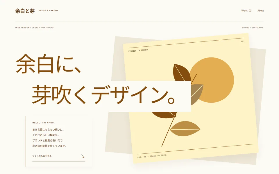
2026-10-20
大きな文字が傾けた植物のポスターに重なり、手前の小さな紹介パネルが奥行きをつくります。明るい紙の面を文字の背後へ置く点が、重なりを読める状態に保っています。
Large type crosses a tilted botanical poster, with a smaller foreground introduction panel. Light paper behind the lettering helps preserve readability through the layers.
表現の個性を先に伝えるポートフォリオや、少数のビジュアル作品の紹介に応用できます。仕様を正確に比較する画面とは役割を分けます。
Use it for a personality-led portfolio or a few visual projects. Keep specification comparison in a more consistent layout.
ポスターを自分の作品に置き換え、見出しと重要な図柄が競合しない配置にします。「重ねるのは余白部分、狭い画面では重なりを弱めて順に並べる」と追記します。
Replace the poster with your own work and prevent the headline from covering important detail. Ask for overlaps on empty areas and a simpler stacked sequence on narrow screens.
図柄の位置を変えると、以前読めていた文字が隠れる場合があります。明暗の異なる画像と長い見出しでも確認し、画面幅だけで合格と判断しないでください。
Changing the artwork can obscure text that was previously legible. Test different image tones and longer headlines, not just overall page width.
元の作品・参考プロンプトを開くOpen the original design and reference prompt · 解説一覧へBack to the notes
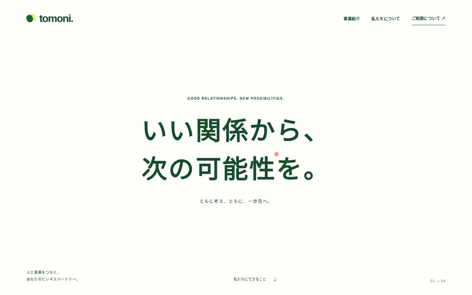
2026-10-19
中央の短いメッセージを大きな余白で囲み、下へ進むと罫線で区切った事業紹介へ切り替わります。写真なしで言葉を主役にした入口です。
Whitespace surrounds a short centered message before ruled service rows appear farther down. Words, rather than photography, carry the opening.
会社や活動の姿勢を短く伝えたい場合に向きます。初めて来た読者が具体的な業務を探しているなら、事業紹介への入口も近くに置きます。
Consider this for a concise company or project position. First-time visitors looking for concrete services also need a nearby route to them.
抽象的な見出しの直後に「誰に・何を提供するか」を一文で補い、事業一覧は実際の提供内容へ差し替えます。スマートフォンでは余白を減らして説明までの距離を短くします。
Follow the statement with one sentence about the audience and offering. Replace service rows with real offerings and reduce mobile whitespace so useful detail is closer.
大きな余白自体が常に有用とは限りません。案内を見つけるまで何画面もスクロールさせないか確認し、架空の企業情報を実績として使わないでください。
More whitespace is not automatically more useful. Avoid making readers scroll through several screens to find information, and do not reuse fictional company details as credentials.
元の作品・参考プロンプトを開くOpen the original design and reference prompt · 解説一覧へBack to the notes
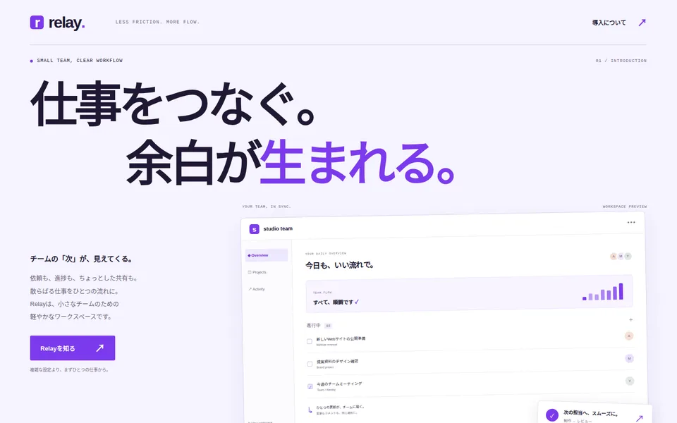
2026-10-18
見出しの2行目を右へずらし、その下の短い説明と大きなUI図を異なる高さ・幅に配置。装飾の違いだけでなく、見出しから図へ読む順序をつくっています。
The second headline line is indented; the copy and larger UI drawing below start at different heights and widths. The structure directs reading from the statement to the illustration.
操作画面の雰囲気を先に伝えたいサービス紹介に向きます。多くの機能を説明し始める前に、誰のどんな作業を助けるかを短く示します。
Use this direction when the product interface should communicate the service before a long feature list. First explain whose work it helps.
UI図を自分のサービスの実画面または明示した概念図に置き換えます。「見出しは横断、説明は短く、画面図は一段上から始める」と構造を具体化します。
Replace the illustration with your actual interface or a clearly identified concept. Specify a spanning headline, brief copy and an interface illustration starting one row higher.
表示中のタスクや通知は静的な図です。操作性やチームの業務改善を実証したものではなく、狭い画面では文字の読みやすさを別途確認してください。
Tasks and notifications are static illustrations. They do not demonstrate usability or improved team outcomes; inspect their readability separately on narrow screens.
元の作品・参考プロンプトを開くOpen the original design and reference prompt · 解説一覧へBack to the notes
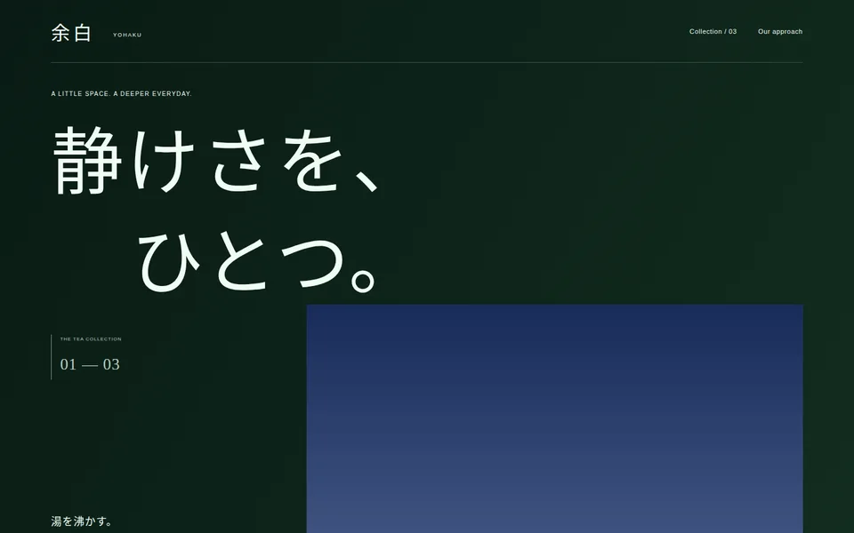
2026-10-16
深い緑の画面で、大きな見出しとビジュアル枠の開始位置をずらしています。公開版の枠は代替ビジュアルのため、茶器そのものの比較資料ではありません。
The deep green opening offsets the heading and visual panel vertically. Fallback visuals make this a composition reference, not evidence for comparing real teaware.
少数の商品をゆっくり紹介するコレクションに応用できます。価格や仕様を横並びで素早く比較する用途では、別の一覧を添える方が分かりやすくなります。
Adapt it for a small, considered collection. Fast price or specification comparison would benefit from an additional consistent list.
見せたい商品の優先順位を決め、写真・名称・説明を同じ対象に揃えます。「商品写真が未提供なら実在品に見える画像を捏造しない」と明示してください。
Rank the products and keep photographs, names and descriptions aligned. State that missing product photographs must not be replaced with invented realistic product images.
見本の価格・容量は実際の商品情報ではありません。狭い画面では大見出しが説明を遠くへ押し下げないか、商品の読む順序が崩れないか確認します。
Sample prices and capacities are not real product information. On narrow screens, check whether the large heading delays useful copy or disrupts product reading order.
元の作品・参考プロンプトを開くOpen the original design and reference prompt · 解説一覧へBack to the notes
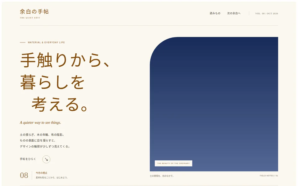
2026-10-13
明朝体の大見出しと縦長の画像枠、その下の目次と本文で、読むことを中心にした構成です。公開版の画像は代替ビジュアルで、陶器・木・布の実物写真を示していません。
A large serif heading and tall visual lead into a contents rail and reading column. Published fallback visuals do not document actual pottery, wood or linen.
素材の紹介、制作記録、短い読みものに向きます。商品購入を急がせる構成ではなく、観察と説明を順に読むための誌面です。
Consider it for material notes, making journals or short essays. It supports reading and observation rather than a fast purchase decision.
見出しと3つの節を、自分で観察・確認した内容に差し替えます。実物の比較が主題なら利用条件を確認した写真を用意し、写真がなければ画像なしの本文構成を指定します。
Replace the heading and three sections with observations you can substantiate. Material comparisons need suitable cleared photographs; otherwise request a text-led layout without images.
参考プロンプトに写真の指定があっても、公開版で実現したことにはなりません。実物の質感や商品性能を代替画像から判断しないでください。
A photo request in the reference prompt is not evidence that the published result contains that photo. Do not infer texture or product performance from fallback imagery.
元の作品・参考プロンプトを開くOpen the original design and reference prompt · 解説一覧へBack to the notes
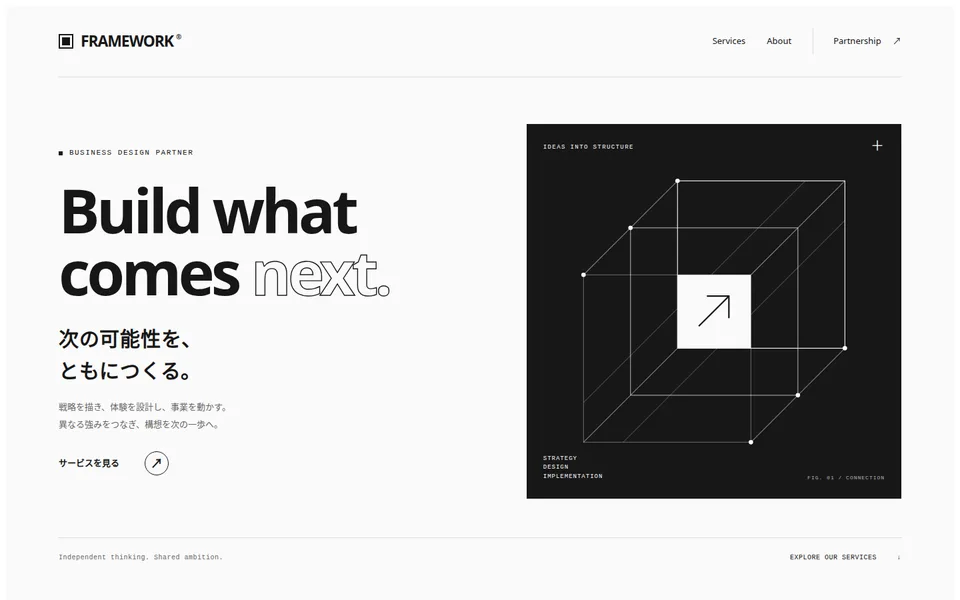
2026-10-12
左の大見出し、右の黒いフレーム図、続く3つのサービス枠で、抽象的な姿勢から提供内容へ視線を移します。写真なしでも図形で印象をつくれる例です。
A large heading, a black frame illustration and three service panels lead from an abstract position to concrete offerings. Geometry provides an identity without photography.
支援内容を3分野程度に整理できる企業や個人事業の紹介に向きます。図形だけでは事業内容が伝わらないため、サービス説明は具体的にします。
It can suit a company or practice with roughly three service areas. The illustration cannot explain the business on its own; keep service descriptions concrete.
3つの枠を実際の提供業務に置き換え、対象者・成果物・支援範囲を書きます。「大見出しを画面幅に収め、長い英単語も折り返す」と指定してください。
Replace the panels with real services, audiences, deliverables and scope. Ask for headings that fit the viewport and long English words that can wrap.
ローカルで再描画した際、320px幅ではページ幅が331pxとなりました。この狭さでは調整が必要な見本です。大見出しと余白を縮め、再度確認してください。
A local re-render at a 320px viewport produced a 331px page width. Treat this narrow layout as needing adjustment: reduce heading size or spacing and check again.
元の作品・参考プロンプトを開くOpen the original design and reference prompt · 解説一覧へBack to the notes
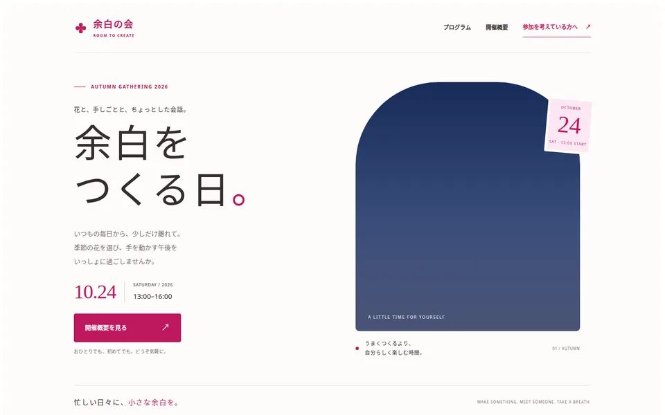
2026-10-11
左側にイベント名・日付・詳細への入口、右側に縦長のビジュアル枠を配置。公開版の枠は青い代替ビジュアルで、花の写真ではありません。
The event name, date and detail link sit left of a tall visual panel. In this published version the panel is a blue fallback visual, not a photograph of flowers.
小規模なワークショップなど、参加前の不安を説明で解く案内に応用できます。日時と参加条件を雰囲気より先に見つけられる状態が大切です。
Adapt it for a small workshop where practical explanations help first-time attendees. Date and eligibility should be easier to find than decorative details.
日付、会場、料金、持ち物を確認済みの情報に置き換えます。写真がなければ「写真風の代用品を作らず、無地の図案と読みやすい概要を使う」と指定します。
Supply verified date, location, price and materials. Without a photograph, ask for an intentional graphic and readable overview rather than a simulated photo replacement.
見本の日付は実際の開催予定ではありません。詳細へ移動するリンクは申込機能ではないため、予約受付を始める場合は別途実装が必要です。
The sample date is not an actual event announcement. Its detail link does not register attendees; booking requires a separate implementation.
元の作品・参考プロンプトを開くOpen the original design and reference prompt · 解説一覧へBack to the notes
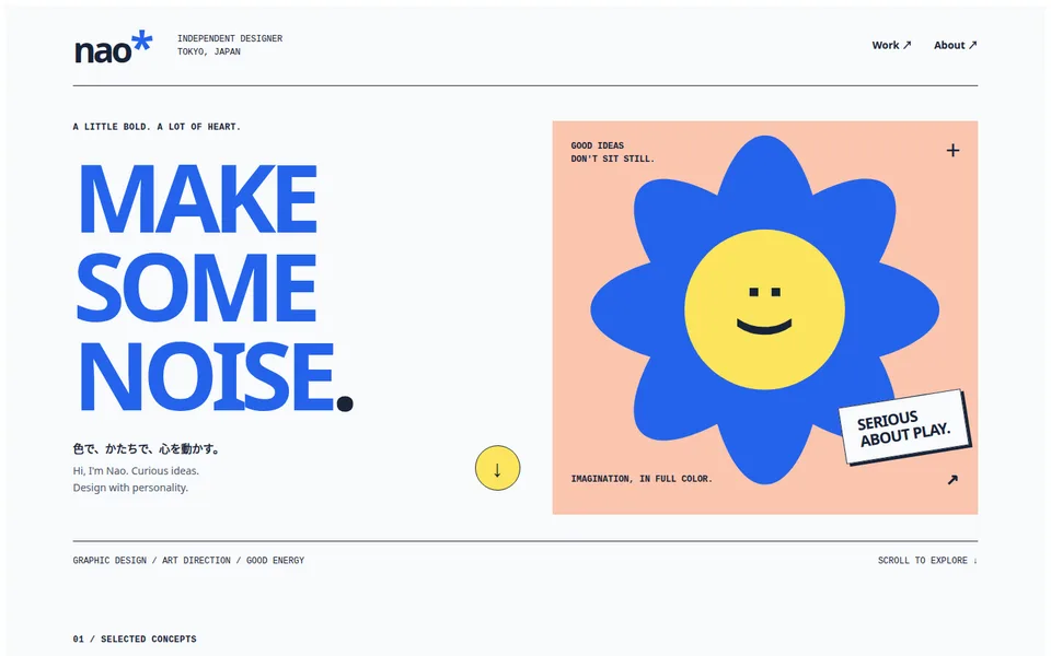
2026-10-09
青い大見出しと花形の図版を左右に並べ、作品一覧より先に制作者の雰囲気を伝えています。図版内の小さな文字は装飾で、本文の代わりにはなりません。
Large blue type sits beside a flower-shaped illustration, introducing personality before the project list. Tiny text inside the artwork is decorative, not a substitute for readable body copy.
独立したデザイナーの紹介や、少数の自主制作を見せる入口に向きます。実績を一覧比較したい読者には、作品への導線を先に示します。
Consider this for an independent designer and a small set of personal projects. Readers comparing experience need an obvious route to the actual work.
見出しを自分の制作姿勢に、3つの作品を実際の成果物に置き換えます。「図版は装飾、作品名と説明は通常の文字サイズ」と参考プロンプトへ追記してください。
Replace the statement and three projects with your own work. Add: “Keep illustration text decorative; render project names and explanations at normal reading sizes.”
架空の自主制作を顧客実績に読み替えないでください。スマートフォンでは見出し、紹介、作品の順で読めるか確認します。
Do not present fictional personal studies as client commissions. On mobile, check the order of the statement, introduction and projects.
元の作品・参考プロンプトを開くOpen the original design and reference prompt · 解説一覧へBack to the notes
同じ「見出し・紹介文・作品3点」を載せる場合でも、最初に見せる情報と余白で読む順序は変わります。以下は使い分けの考え方です。見た目の好みだけでなく、読者が最初に知りたいことに合わせて選んでください。
Even with the same information—a heading, introduction and three projects—opening emphasis and whitespace change the reading order. These are starting points for choosing a composition around what your reader needs to know first.
以下の解説は公開時の最初の画面を確認した観察です。同じ内容を使った比較実験ではなく、成果や優劣を示すものでもありません。作品ページの説明と参考プロンプトも合わせて確認してください。
These notes describe observed openings of published designs. They are not controlled comparisons using identical content or claims of performance or superiority. Read the design explanations and reference prompts alongside them.
大きな見出しの行頭をずらし、その下で短い説明と大きなUI図を異なる幅で配置しています。色より、文字・説明・図を読む順序に注目してください。
The large headline has staggered line starts; below it, a short explanation and a larger UI illustration use different widths. Compare the reading order of type, explanation and illustration before color.
作品と参考プロンプトを確認する →Explore the design and reference prompt →中央の見出しの周囲に大きな余白を取り、最初の画面の情報を絞っています。会社の姿勢を短く伝える例として、詳しいサービス説明へ進む導線も確認してください。
A centered headline is surrounded by generous whitespace, with little competing information in the opening. As an example of stating a company position briefly, also inspect the route to its detailed services.
作品と参考プロンプトを確認する →Explore the design and reference prompt →大きな文字が、傾けた植物の図版に重なります。文字の背後の明るい面と図版の位置関係を観察し、重なりを取り入れる場合も文字を読める状態に保ってください。
Large type overlaps a tilted botanical illustration. Observe the light surface behind the type and the illustration placement; preserve readable text when borrowing the layering.
作品と参考プロンプトを確認する →Explore the design and reference prompt →Promptiveの参考プロンプトは、見本の見た目を手がかりに、別のAIへ制作意図を伝えるための文章です。丸ごとコピーするだけでなく、目的と内容を具体的に置き換えると、自分のページに必要な条件を伝えやすくなります。
アーカイブで、まず「何を最初に伝えたいか」に合う構成を選びます。文章を読ませたいなら文字中心の構成、複数の商品や作品を比較してほしいなら一覧やカードの構成が候補です。大きな画像が必要か、見出しの次に何が来るか、情報量と余白の釣り合いも見比べてください。
例えば、写真の多い作品紹介を店舗案内へ応用するなら、全作品を並べる構成をそのまま使うより、「店の特徴・メニュー・場所」のどれを先に見せるか決めると、必要な変更が分かります。好きな配色と、目的に合う構成は分けて考えられます。
作品ページで参考プロンプトをコピーし、次の3点を先に書き換えます。①誰が読むか、②読んだ後に何を知ってほしいか、③実際に載せる文章や項目は何か。架空の商品名や実績を残さず、自分で確認できる情報に置き換えてください。
写真と短い説明を非対称に配置するポートフォリオを作成してください。大きな作品タイトル、作品一覧、プロフィールを設け、余白と文字の強弱で読む順序を示してください。
近隣の人が来店前に店の特徴と場所を確認できる、ベーカリーの静的な紹介ページを作成してください。非対称な配置と余白の取り方は参考にし、作品一覧を「定番のパン3種類」、プロフィールを「店の紹介」、末尾を「営業時間と住所」に置き換えてください。写真がない場合も文章で理解できる構成にし、狭い画面では店の紹介、パン、営業時間と住所の順に読めるようにしてください。予約・購入機能は作らず、未提供の商品情報や実績は追加しないでください。
上記は書き換え方を説明する例です。実在店舗の導入実績や、生成・動作確認済みの完成品を示すものではありません。
「文字の大小による強弱と不均等な余白は残す」「写真中心から文章中心へ変える」のように分けて伝えます。構成まで変えたいときは、その理由も添えます。色だけを変更する依頼では、情報の並び方は変わりにくいためです。細かい装飾を指定しすぎず、最も重要な特徴を2〜3点選ぶのがおすすめです。
生成したページは、デスクトップだけでなく390px前後と320px前後の狭い画面でも確認します。横スクロール、読みにくい補助文字、画像で切れてしまう重要な部分、内容の読む順序を見てください。修正依頼は「スマートフォンでは営業時間が先に見つかるように」「見出しと写真が重なる部分で文字を読めるように」など、困った箇所と期待する結果を具体的にします。
PromptiveのpreviewはHTML・CSS・安全なSVGによる参考作品です。一部の作品ではタブやメニューなどの表示切替を試せます。見本のボタン、予約欄、カート等が実際に動くとは限りません。問い合わせ送信、決済、予約、個人情報の保存などは、別途実装と確認が必要です。参考プロンプトによる完全な再現や、利用先のAIでの動作は保証していません。
写真や文章の利用条件、実際の掲載情報、リンク先も公開前に確認してください。このガイドや公開サイトからAI生成を開始することはできません。
A Promptive reference prompt describes a design direction you can take to another AI. Replace its purpose and content with specific requirements rather than copying a sample unchanged.
Use the archive to choose a composition that fits what readers need to learn first. Typography-led pages can suit reading; grids or cards can help people compare several items. Compare the need for a large image, what follows the heading, and the balance of content and whitespace.
When adapting a project portfolio for a shop, decide whether the shop’s story, products or location should come first. A palette you like and a structure that serves your audience are separate choices.
Copy the reference prompt from a design page. Specify who will read the page, what they should learn, and the actual text or sections to include. Replace invented names or achievements with information you can verify.
Create a portfolio with asymmetric photographs and short descriptions. Include a large project title, a project collection and a profile. Use whitespace and type scale to establish the reading order.
Create a static bakery information page so nearby residents can find the shop’s character and location before visiting. Keep the asymmetric placement and use of whitespace. Replace projects with three staple breads, the profile with the shop’s story, and the final section with opening hours and an address. Make the page understandable without photographs. On narrow screens, present the story, breads, then hours and address. Do not add booking or payment functionality, invented product facts or unverified achievements.
These are illustrative writing examples, not a real client case or a generated and tested finished page.
For example: “keep the type hierarchy and uneven whitespace; replace photo-led content with text.” Explain why if the composition needs to change. Changing only colors is unlikely to change the information order. Choose two or three important qualities rather than prescribing every decoration.
Check desktop, roughly 390px, and roughly 320px widths. Look for horizontal scrolling, tiny supporting text, important parts cropped out of images, and an unsuitable reading order. Describe the problem and outcome: “make opening hours easy to find on mobile” or “keep the heading readable where it overlaps the image.”
Previews use HTML, CSS and safe SVG. Some designs offer display controls such as tabs and menus. Sample buttons, booking fields and carts may not work. Sending messages, taking payments or bookings, and storing personal information require separate implementation and checks. Reference prompts do not guarantee exact reproduction or working results in another AI.
Check rights to images and text, factual content and link destinations before publishing. This guide and the public site cannot start AI generation.